 # 5 An artists style is anything in the artists artwork that is unique to him/her. This can vary from different mediums to a certain way they draw. This can also include what an artist draws about, or what they draw such as people or landscapes. 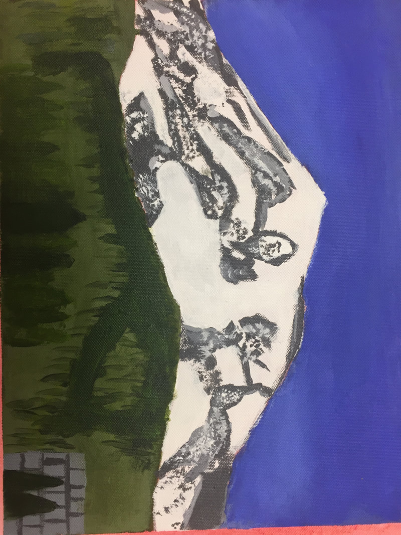 #7 The point of this class is twofold. One purpose is to further express your creativity through art. The other is to teach you different ways of making art and what it means to be an artist. Because of this class my creativity and ingenuity when making art has improved. My lines are also less shaky and more bold and straight. And the overarching thing I've learned is to draw what you see and not what you know. 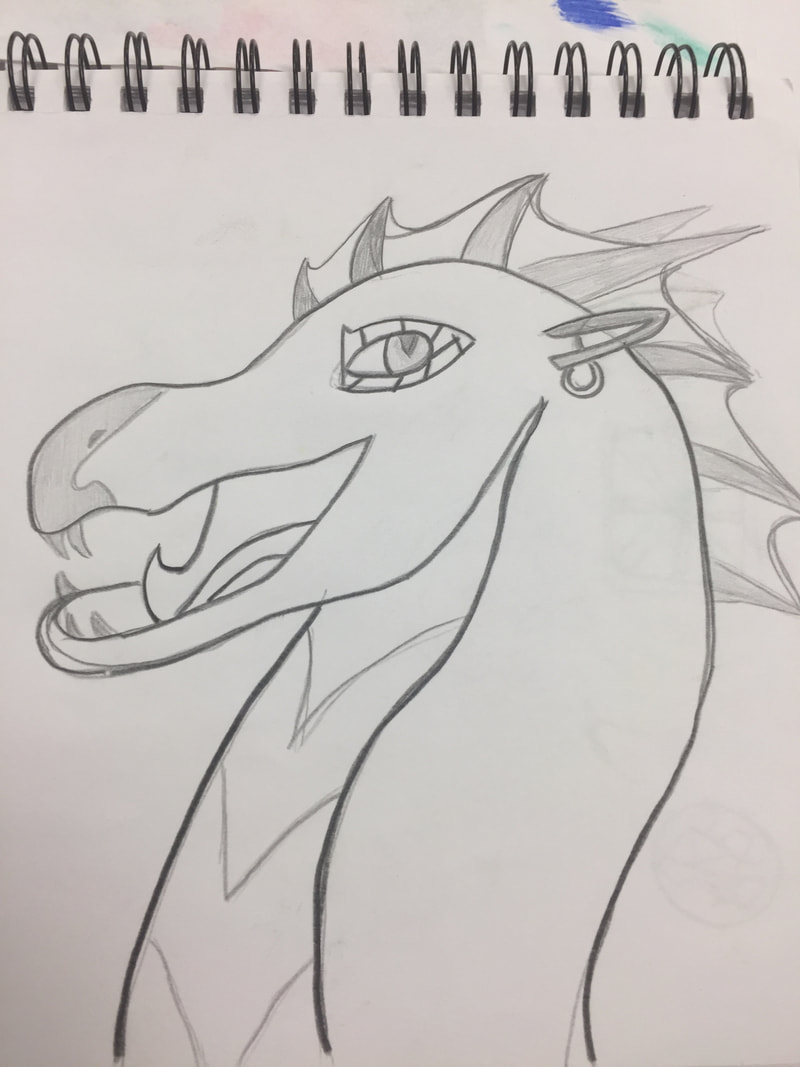
0 Comments
the art criticism process starts with describing the art or what you see, then you analyze the art such as what elements or medium, after that you interprete the art in things like the mood. Finally you judge the art and if it was successful and if it got the point or meaning across. i will becritiquing a drawing of a dragon I did. To make this piece I started with a brainstorm map. 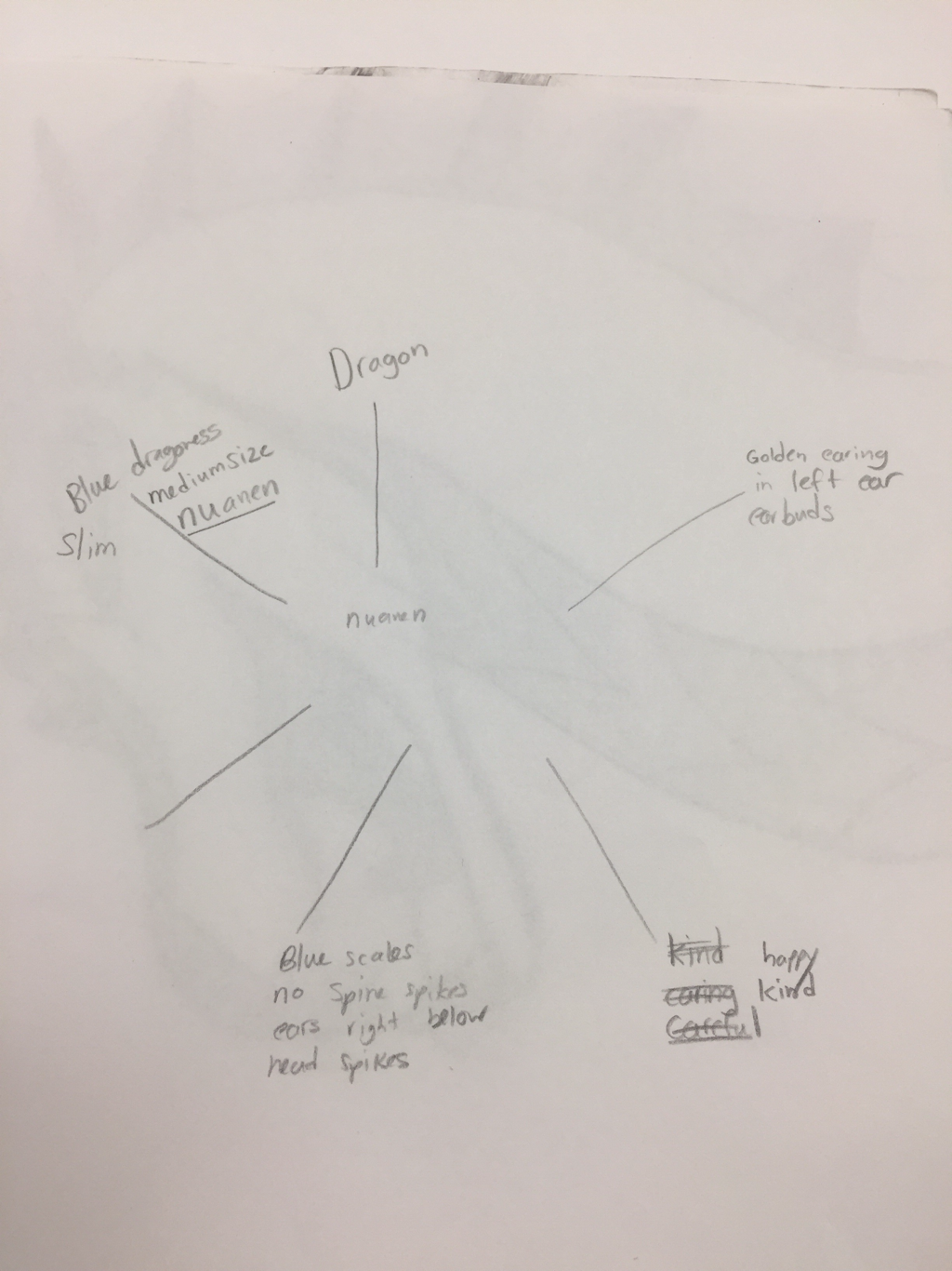 aftet I completed the brainstorm I went on to make my first draft of the piece taking inspiration from posts on Instagram 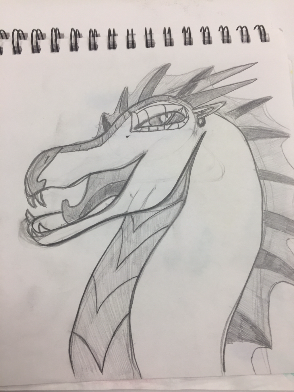 after making the first draft I decided that my dragon was far to sinister looking so I redid the drawing and it turned out much nicer 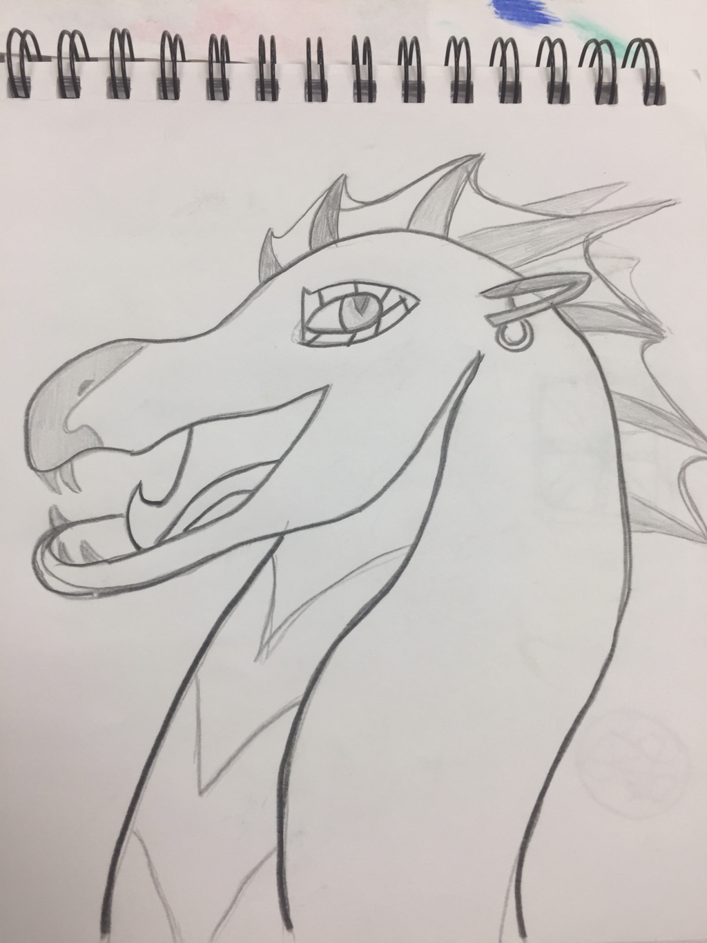 after I was satisfied with my drawing I transferred it to a different paper and painted it with water color.  after completing this piece I was impressed with the result but I feel I could do better given more time and experience. I believe the message of this piece is peacefulness. There is a clean sandy beach in the background and a cloudless sky beyond that, combined with a friendly looking dragon gives me an at peace feeling. I learned that watercolors can be beset hard to work with because the colors don’t go on as smooth as acrillic paint. I also learned that a characters expression all depends on their eye position and shadow.
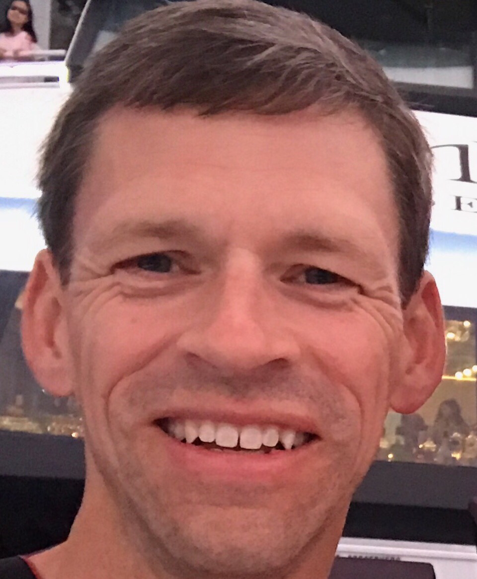 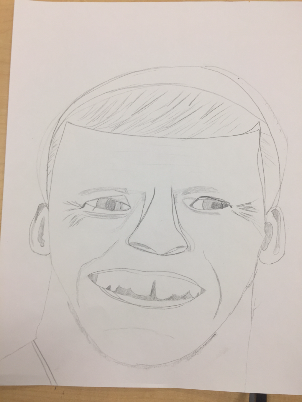 I drew my dad. I used pencil for my medium and if I were to draw this again I would draw very light guidelines to line everything up. I think I did the face relatively well considering I am awful at drawing people. I started with the neck and worked my way up the body. After finishing the contour I drew the mouth and nose then added in the eyes. After that was done I finished the wrinkles and hair.
after the firing I added yellow glaze and black detailing. After the glaze was fired I added the marbles to the eye and the sun/moon. I would change how I made the lid because it didn’t exactly fit. I would also apply the glaze more evenly. 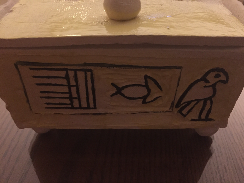 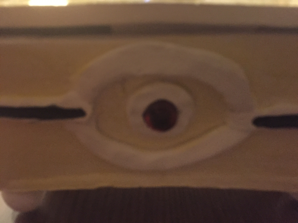 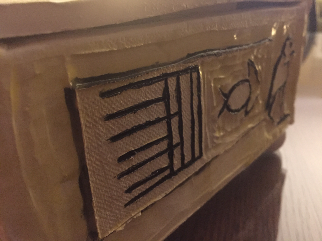 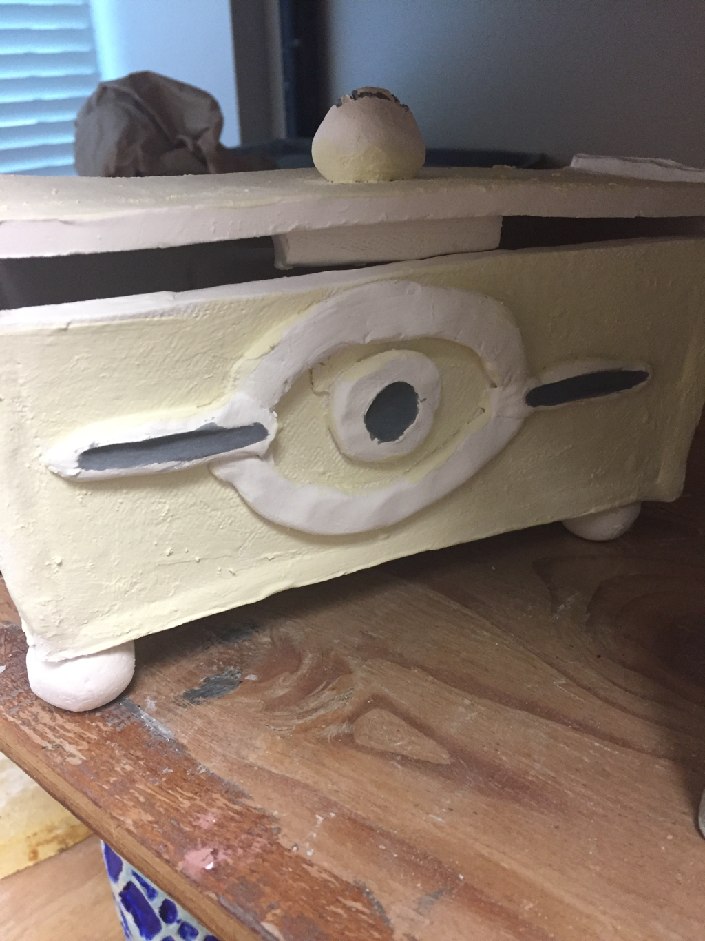 my plan is to after the firing to add yellow and black glaze to make it look gold. So far the difficult part is making sure the lid will fit and getting the structure solid. I was successful in the structure in making sure it’s solid. I took the clay blocks and cut them to size then slipped together. After that was solid I added the feet.
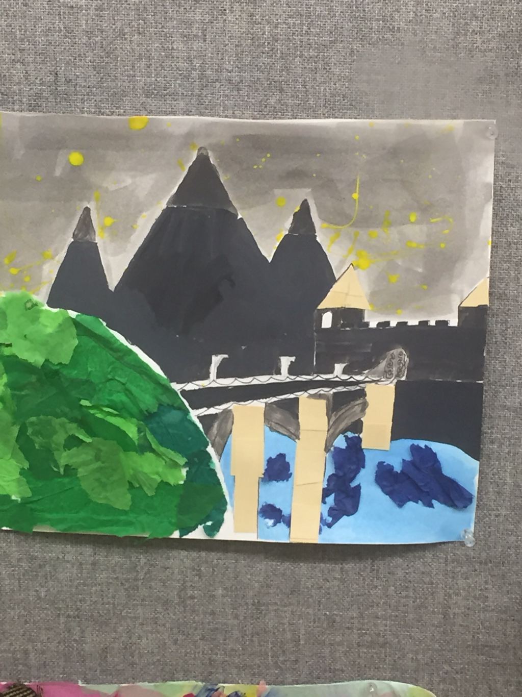 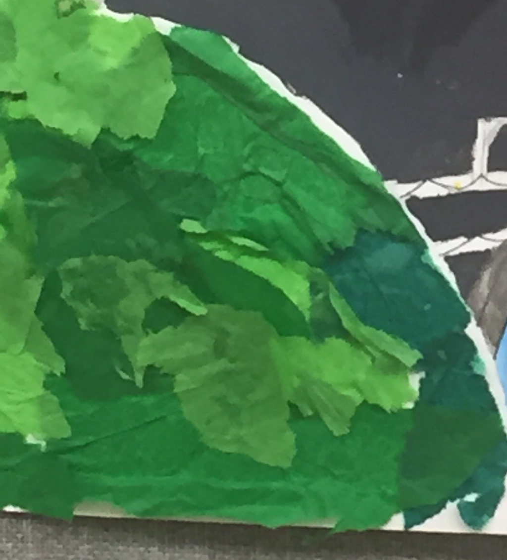 for my project I used 5 mediums. I used watercolor for the night sky and the water. Acrylic for the mountains and the rocks, castle and bridge. I used stacked paper for the roof shingles and the stones in the bridge. I used tissue paper for the grass and water effects. And finally I used India ink for the outlining and the gate designs. My word for this project was stars which I made with splattered acrylic paint.
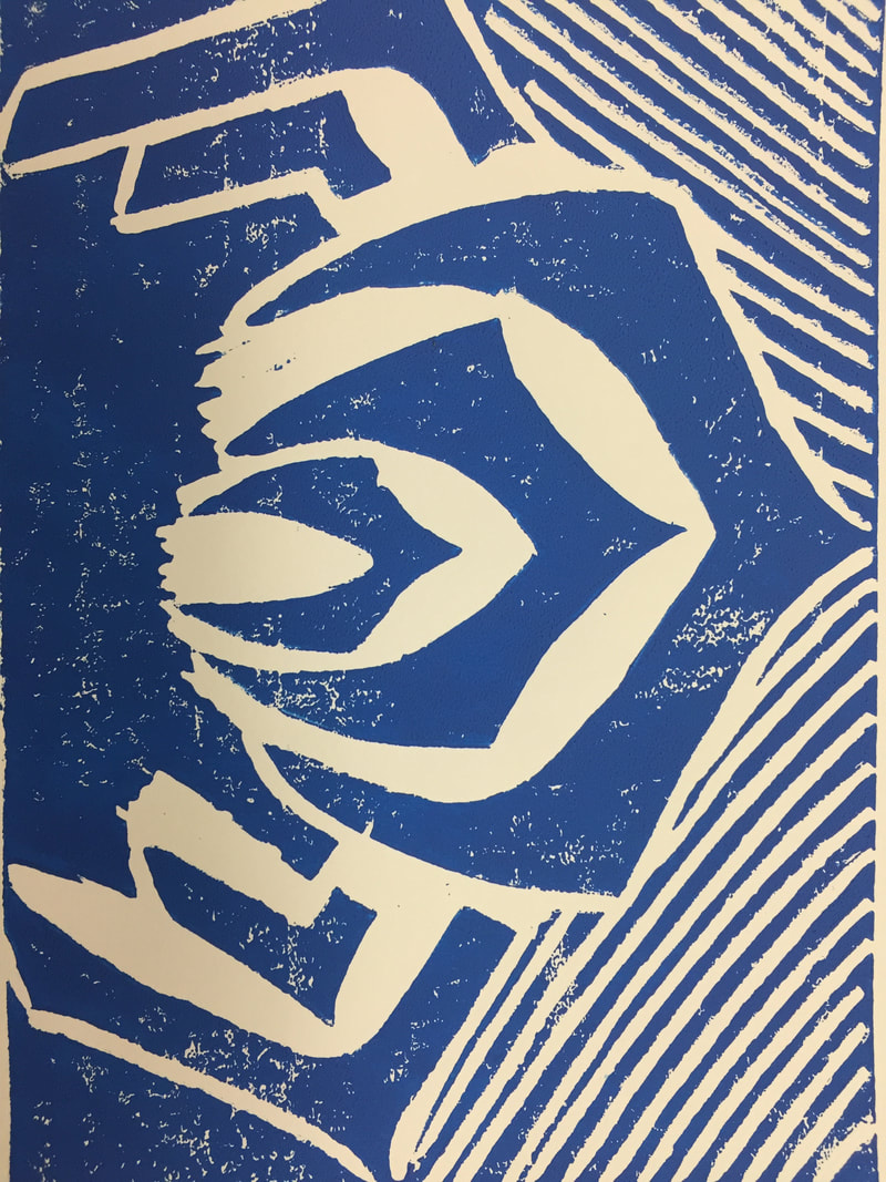
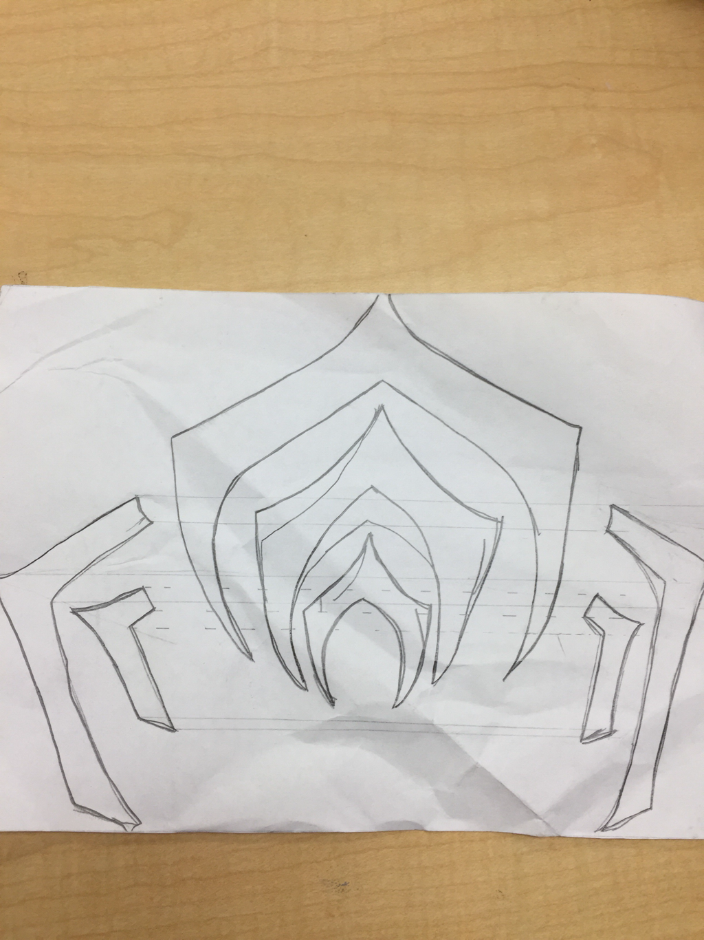 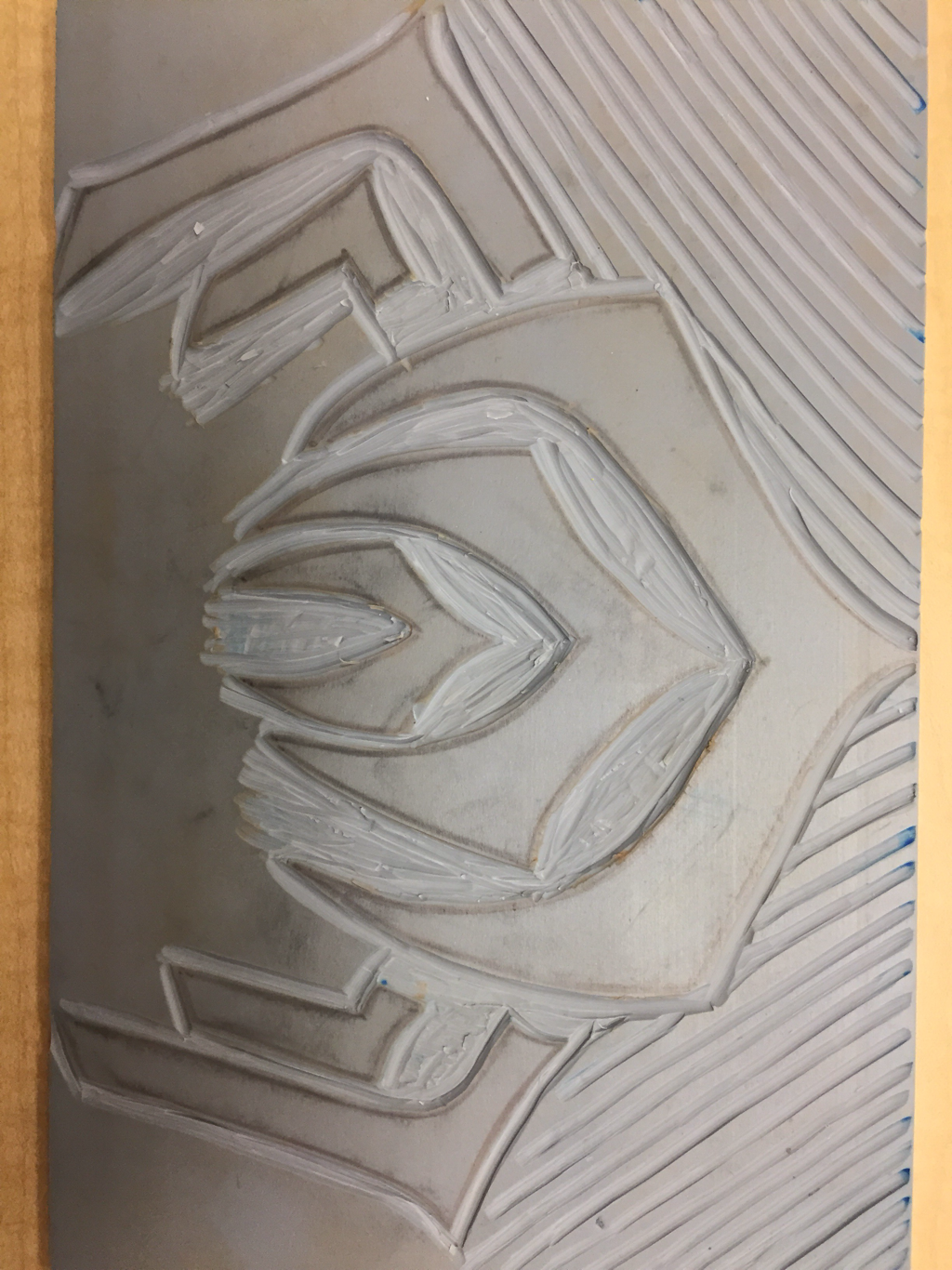 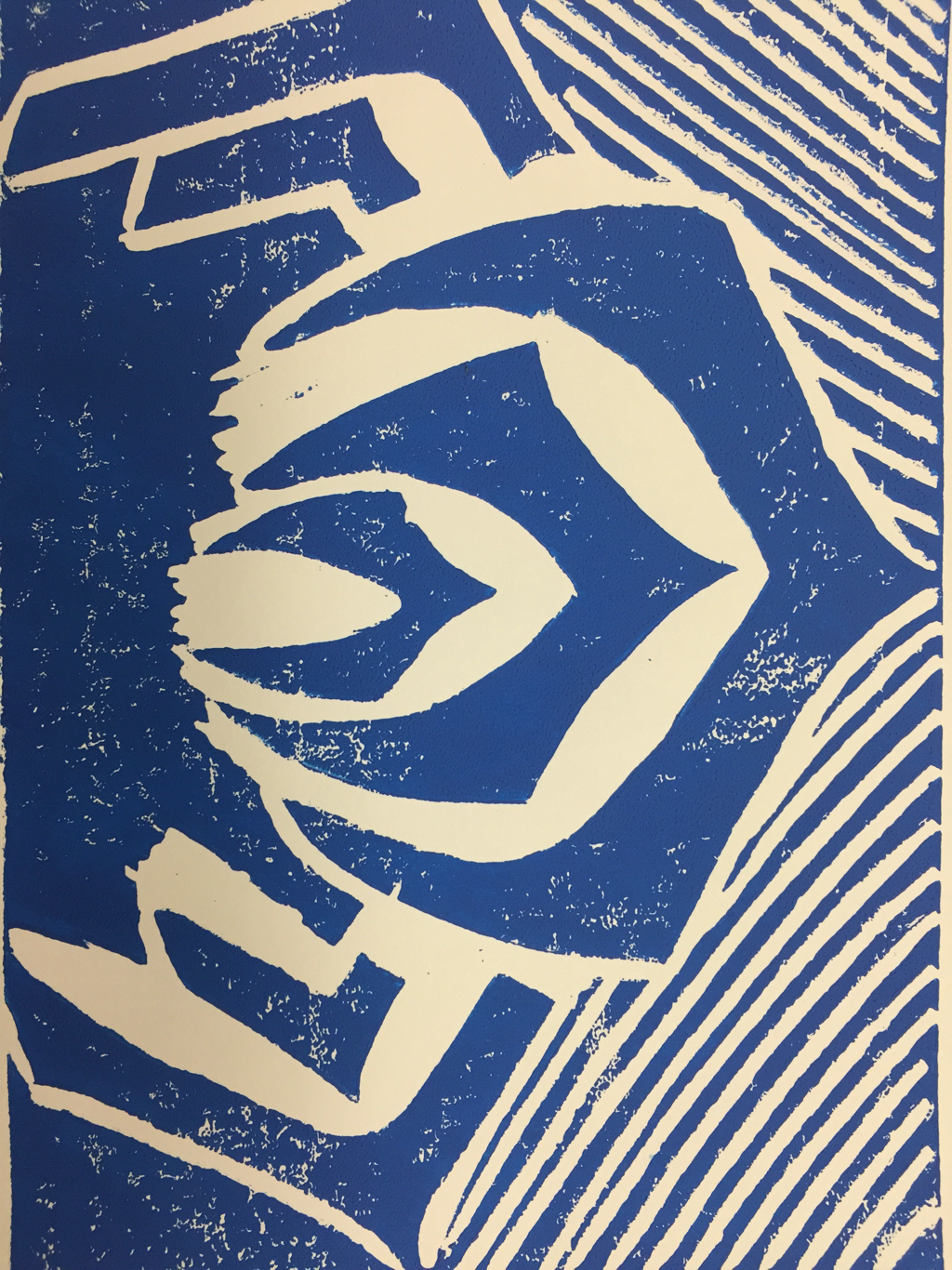 My project shows the theme of line by consisting of nothing but. This includes each individual part of the symbol and the lines above it. My process for this project was to scetch the symbol then transfer it to the linoleam block. After that I cut out the material around the symbol and added lines. I would make sure to make both sides even next time as the way I did it makes it feel lopsided. I would also try multiple colors
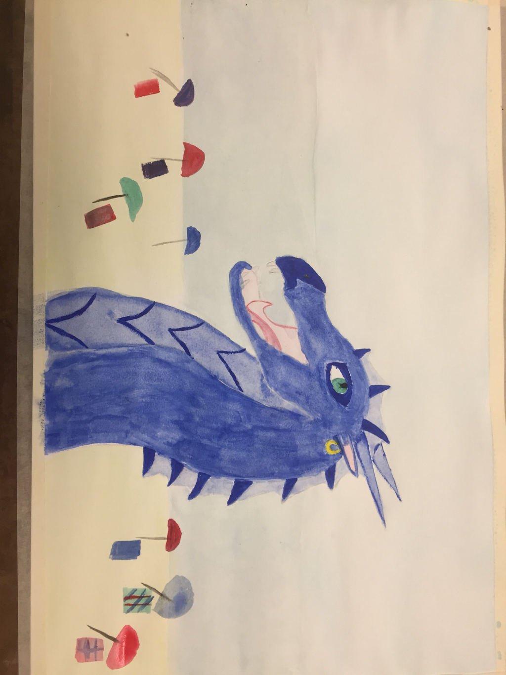 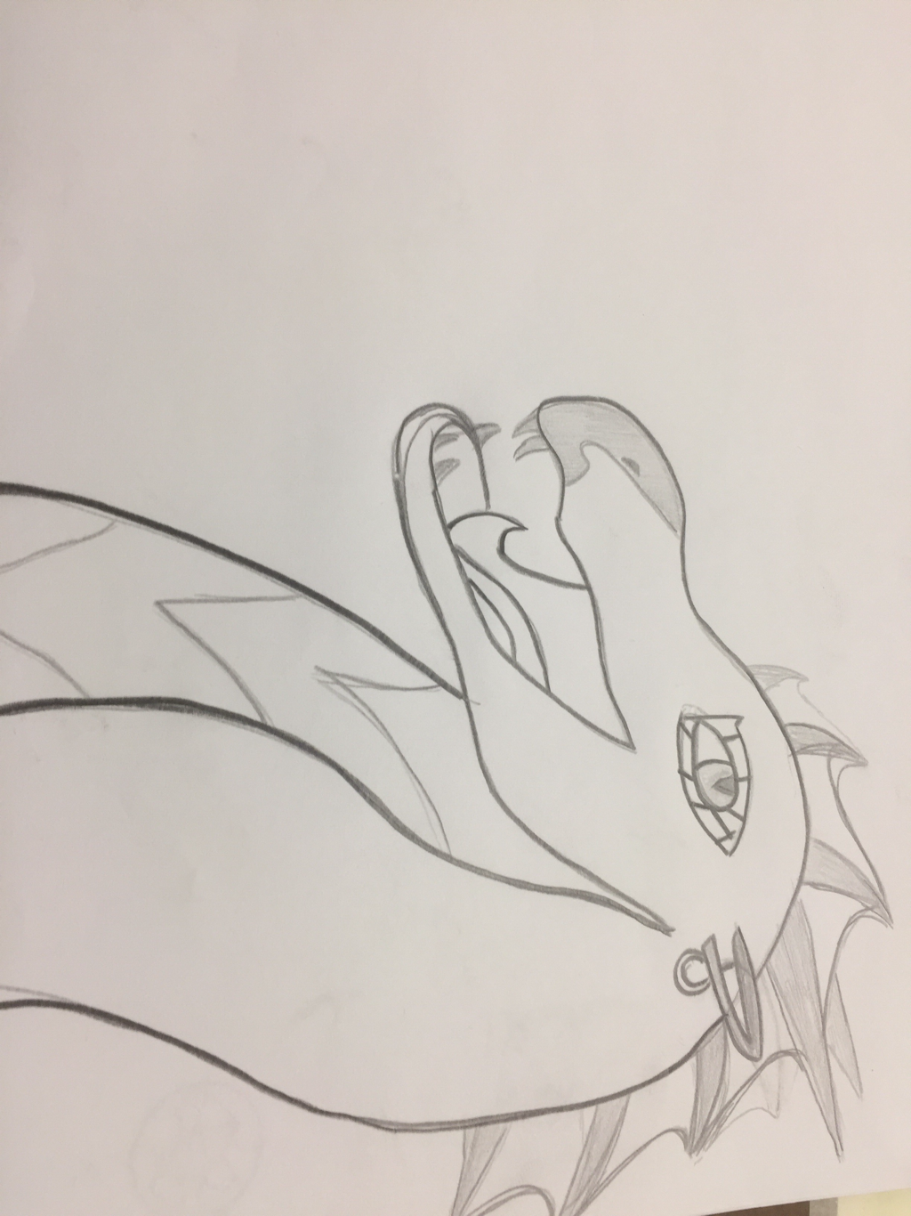 The most helpful warmup for me was the book image warmup 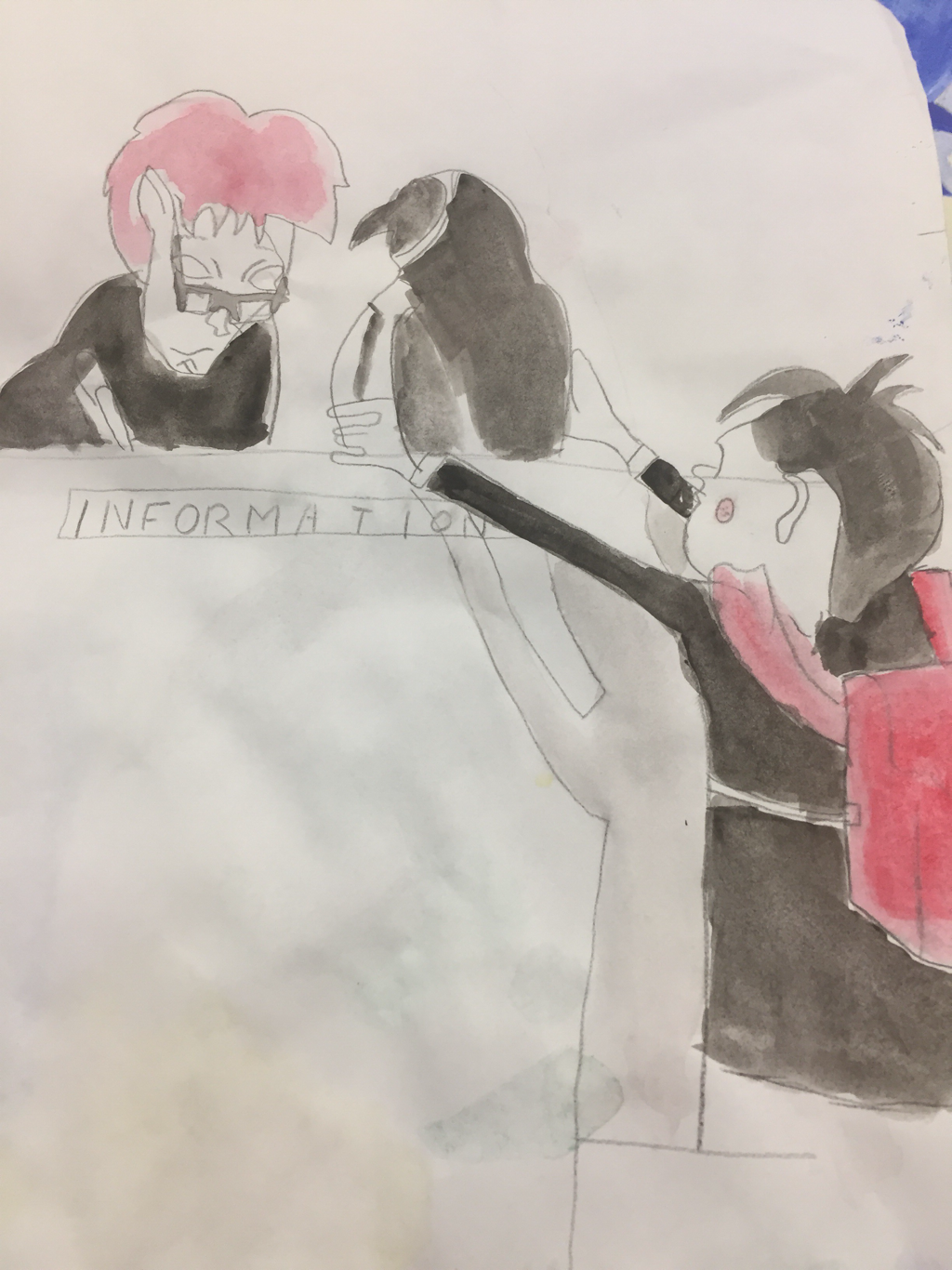 For this project I created my own character using images from a book called Wings of Fire and a few Instagram posts. My dragon combines the two using color from the book and the body shape from the Instagram posts. My advise for anyone working in this medium is to take your time and work from back to front. I also advise that you have a very clear picture of what you want, otherwise you end up with a misscolored picture. 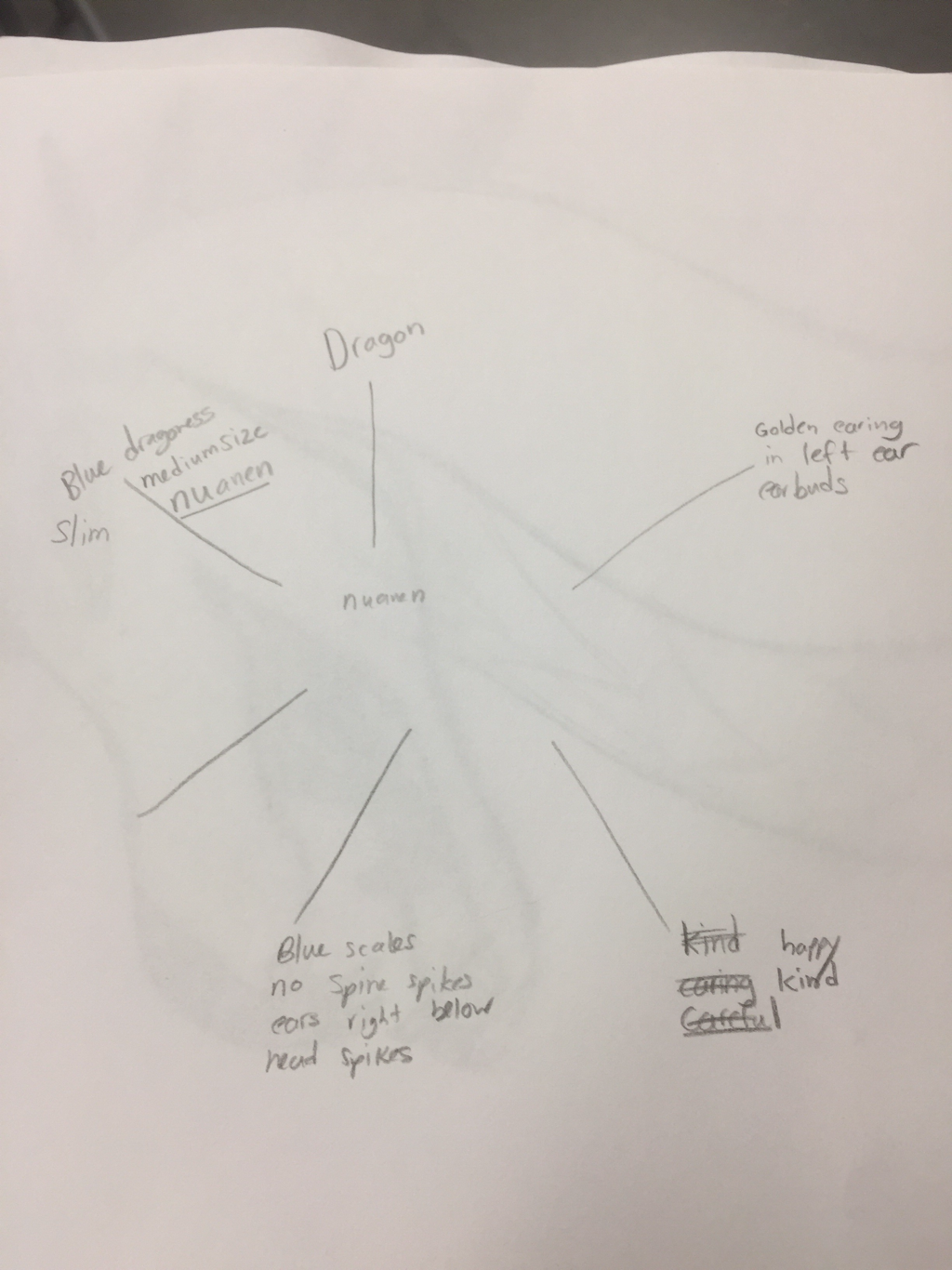 My process for my project was to get the base coloring for the dragon first then foucused on the details such as the earing and the fins on the back. Then I created the sandy beach and the ocean. After both dried I painted on the sky and added the beach umbrellas and towels.
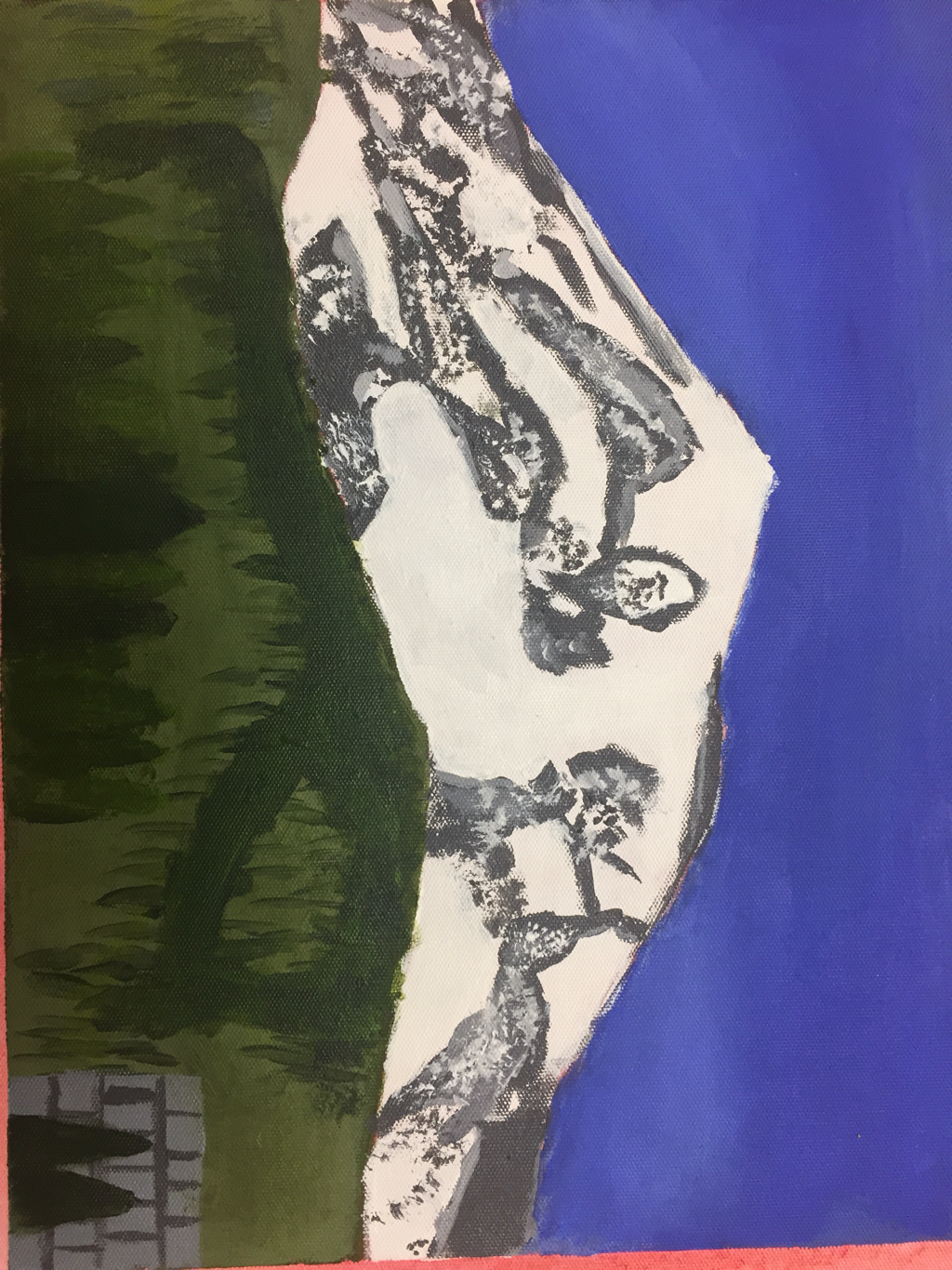 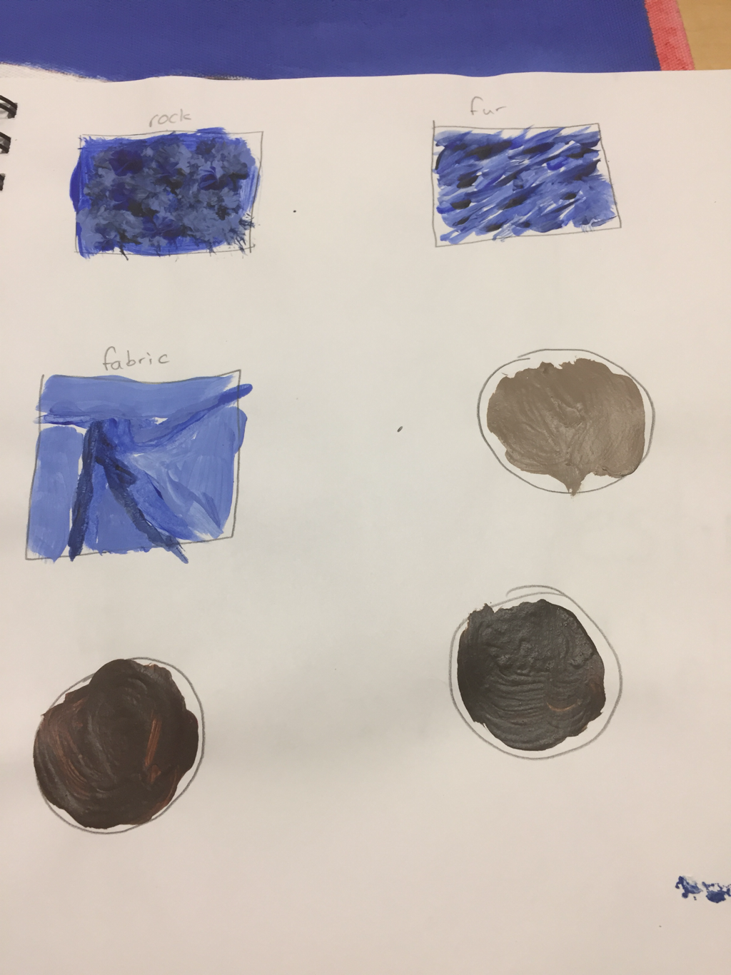 The place represented in my art is Mt. Rainier. This place is important to me because no matter how big you think it is it’ll always be bigger. It’s sheer size astounded me. I found trying to get the trees right and the rocky texture on the rocks the hardest. Even though the rocks were the hardest I feel I succeeded the most on those. I worked from back to front. Starting with the sky and getting the shading just right. Then I filled in the mountain with white and after that dried added texture in the form of rocks. I then painted the grass and trees then going back to add shading and detail.
|
AuthorWrite something about yourself. No need to be fancy, just an overview. Archives
January 2018
Categories |
 RSS Feed
