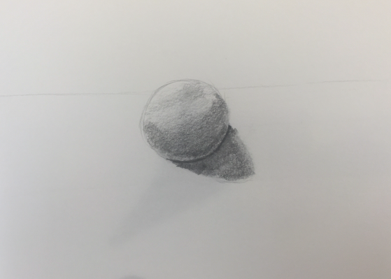
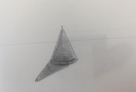
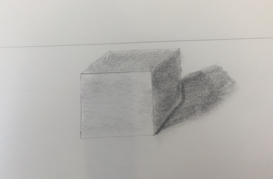
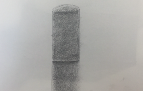
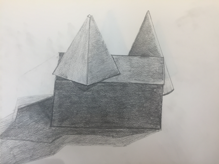
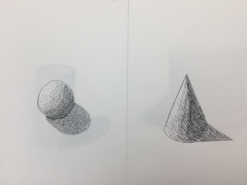
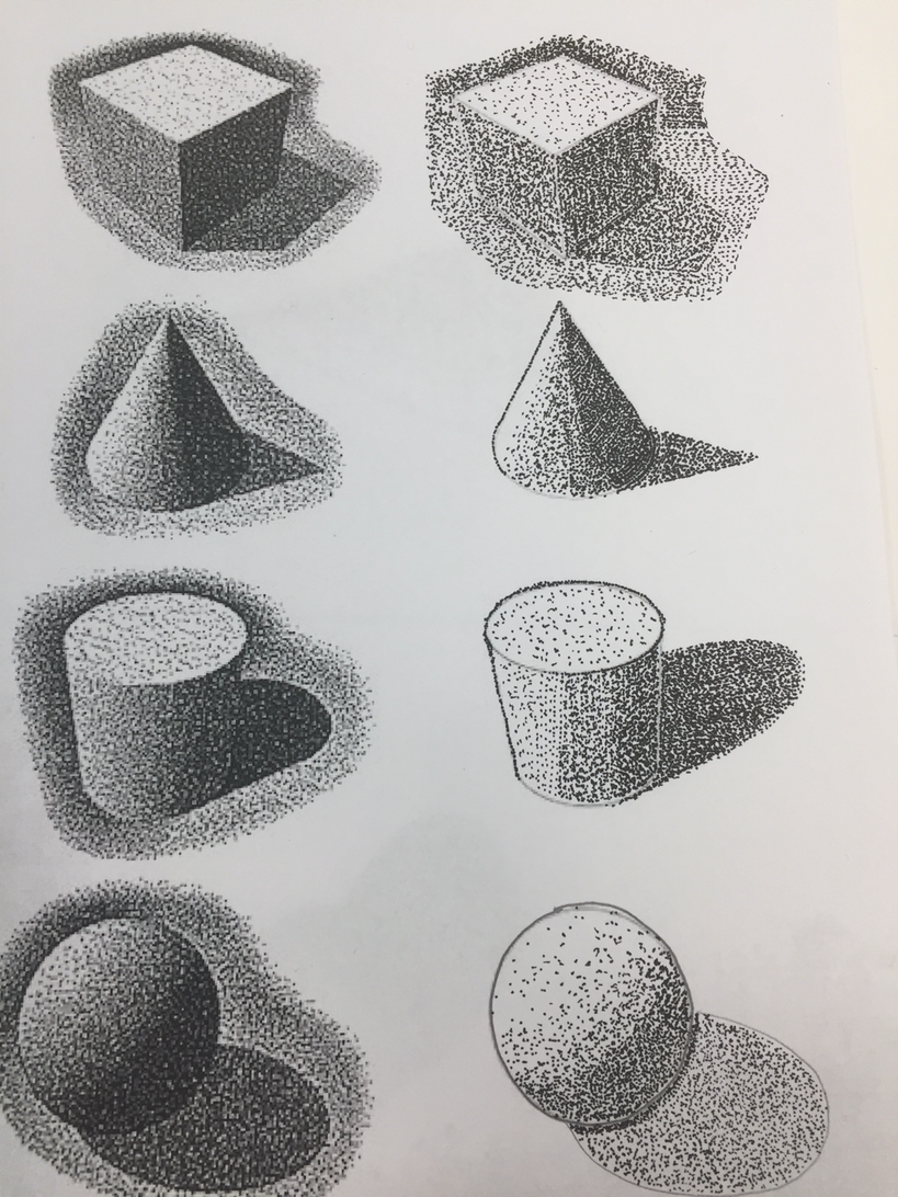
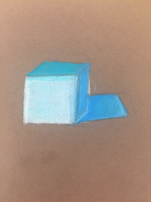
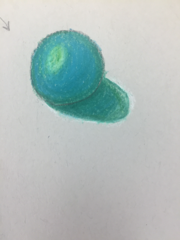
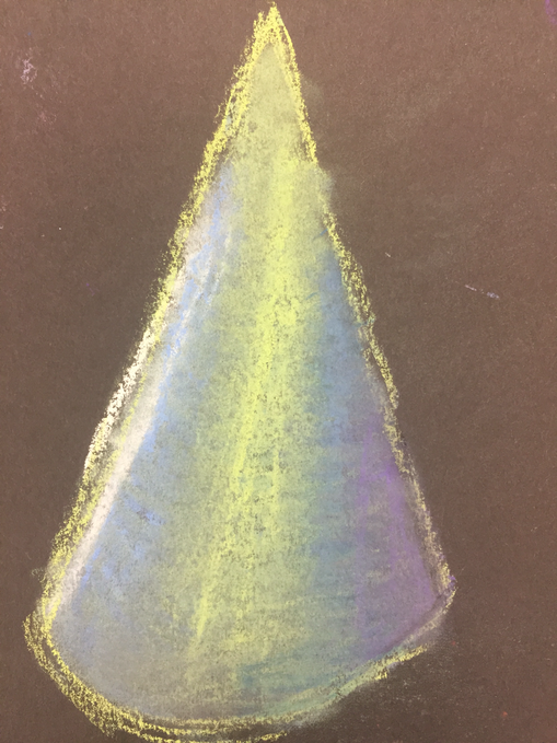
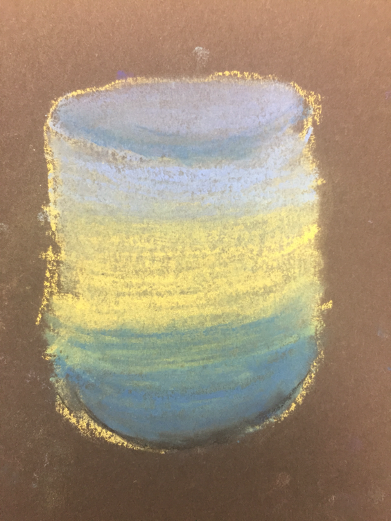
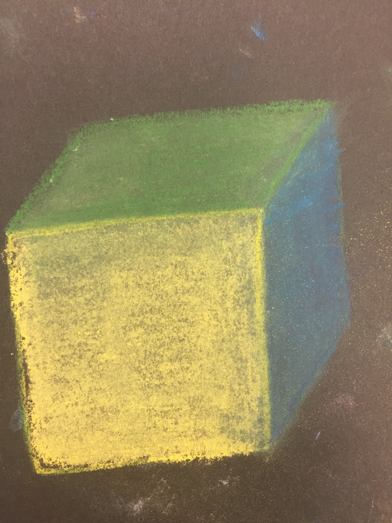
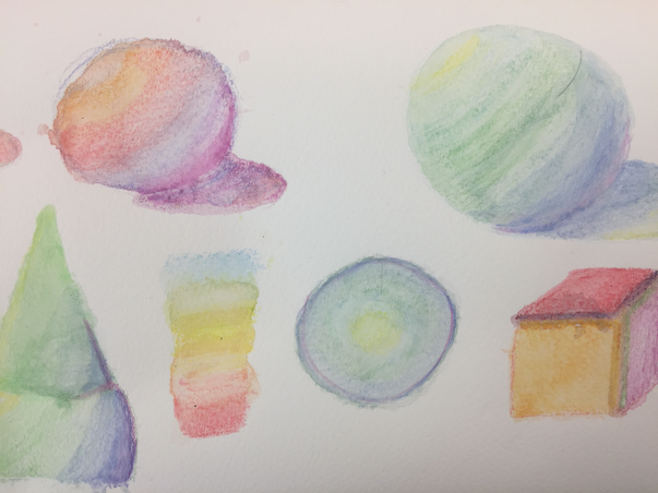
got the shapes with shadows I first tried to ge the shape in without it floating. Then I tried to imagine a light source hitting it from different positions, finishing by adding value
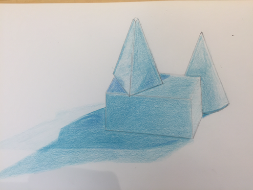
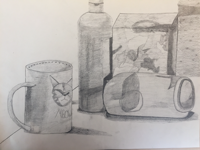
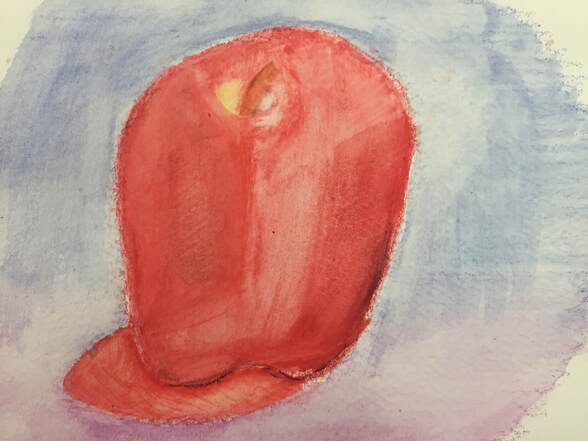
these two were done on two separate days with different lighting and positioning. The first I started by lightly sketching what I saw then adding value throuout. The second I started with pencil then added value and color with the colored pencil using a darker shade of blue for the more pronounced shadows.
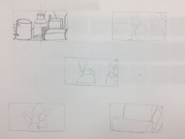
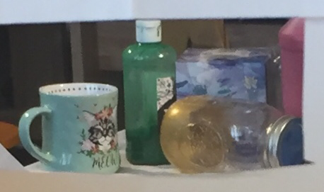
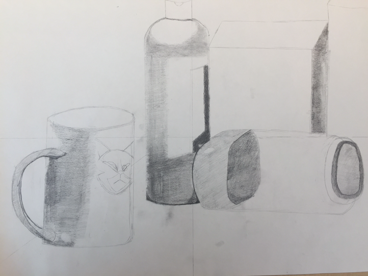
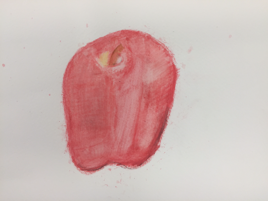
i arranged my composition around the right hand side of my piece. As you move from right to left the objects get closer to the camera allowing stronger shadows and detail. And I believe it is a successful composition. To capture the shadows in the photo I tried to use many layers of shadow and pencil to get 9 levels of shadow. The darkest of which is on the bottle and the lightest around the cats mouth. The practice drawings allowed my to learn how an object interacts with the light in a photo from refractions of the light to the shadow progressing in depth as you get closer to the base. To try and make the transitions of the shadow as smooth as possible I tried to get progressively harder or softer as I filled in a shadow then foucused on ensuring it was a good depth based on the rest of my drawing. Texture in my drawing is important because without it you wouldn’t realize what the objects were. Such as the bottle with stickers or the jar made of glass, both are different in how you have to shadow them. If I had to redo my drawing I would ensure that I had my scale right as I found myself having to redraw some of it to match the other objects in size or direction.
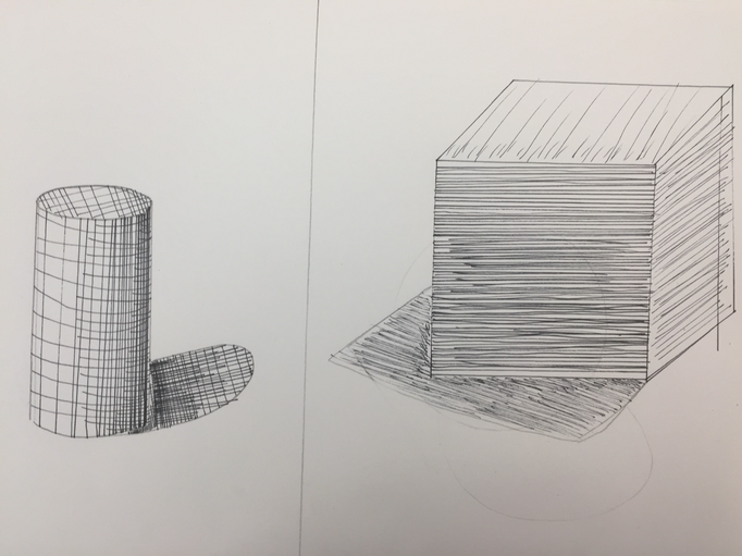
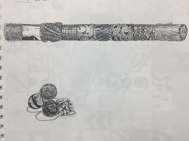
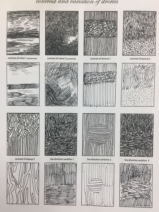
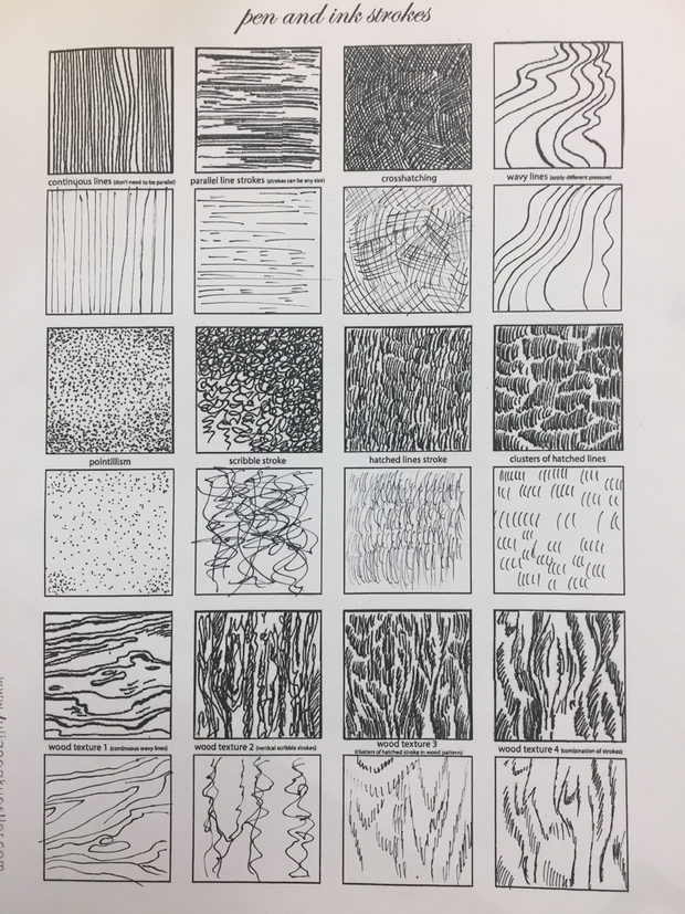
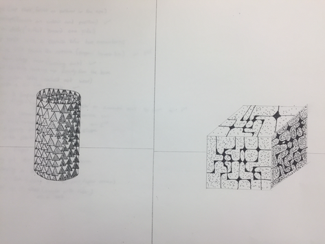
The shading on all of the pen drawings( the video and the shape) was my biggest adversary. To show depth with a pen you need to really make some areas darker and it is very difficult to do that and curve it around the object. But these exercises really gave em some good insight into patterns and shading( my favorite probably being the long cylinder from the video)
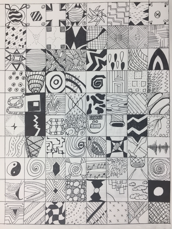
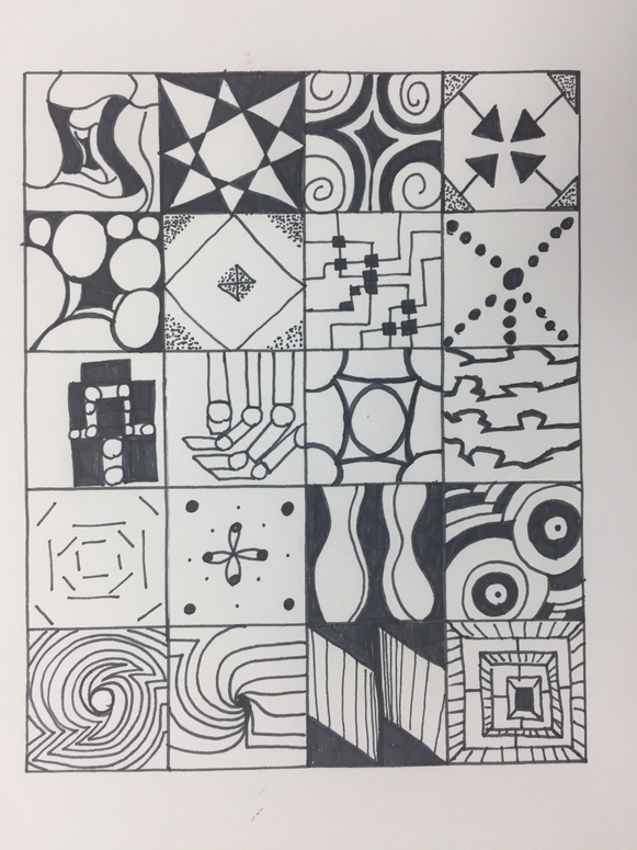
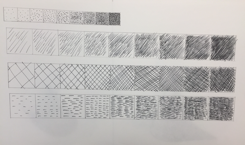
For my 100 textures I tried to mix and match with different combinations of lines and designs, such as starting in the same corner but moving in different ways.I also tried to experiment with depth and realistic textures. The patterns that i found to be the most visually appealing and unique were the ones that had a common theme but no distinguishable pattern or rhythm to them. These include the one that looks like lightning bolts and the one that has random lines with curved intersections.
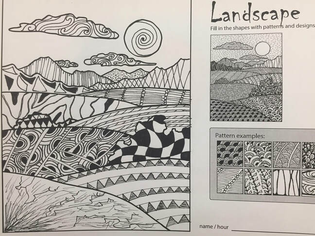
These pattern drawing were much harder except for the landscape where you had a little more freedom. Trying(and failing) to copy those textures was the bane of my existence and the most difficult challenge to overcome in this project. I owe this to the fact that the patterns were layered in a way that i couldn't replicate.
Final
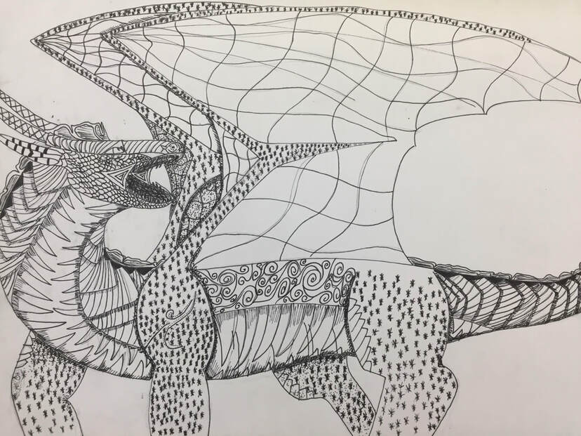
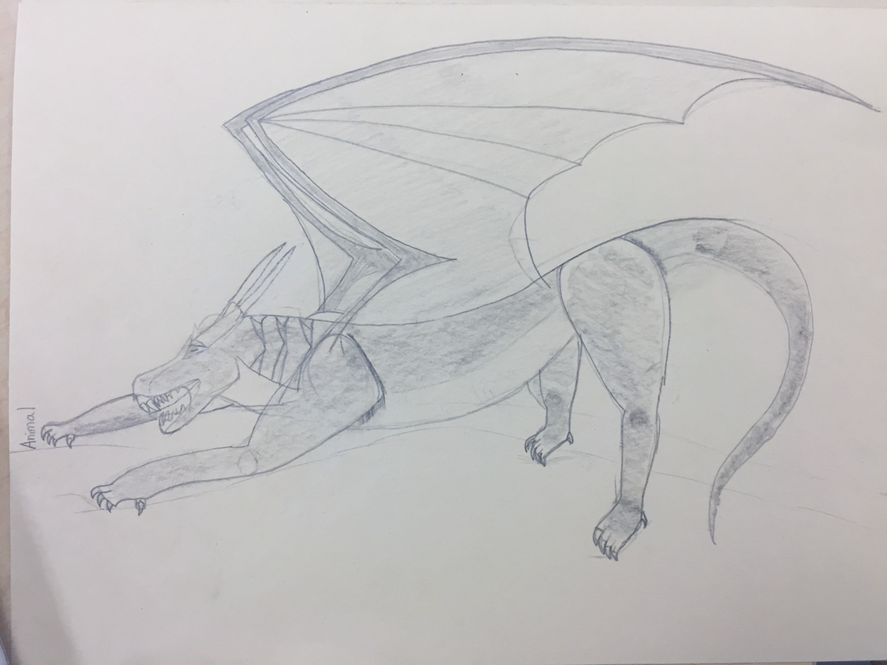
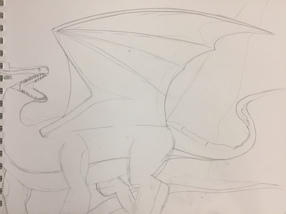
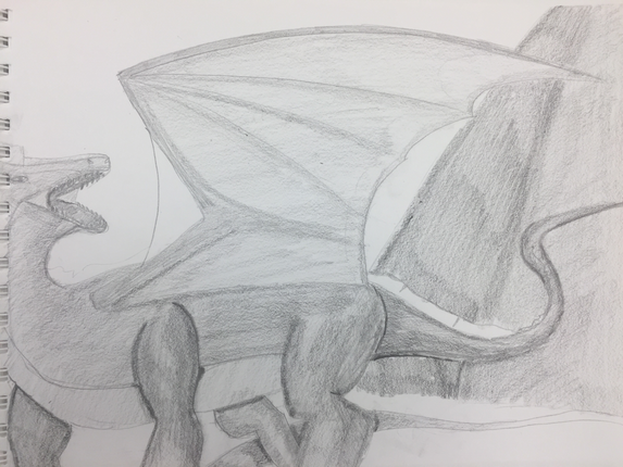
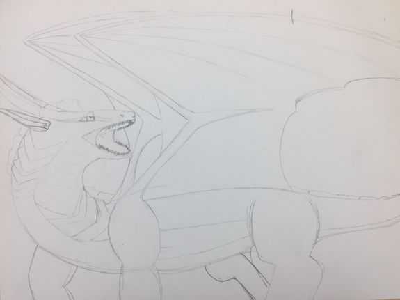
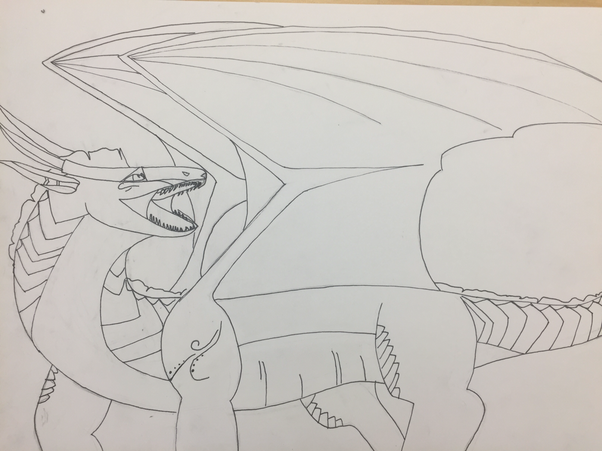
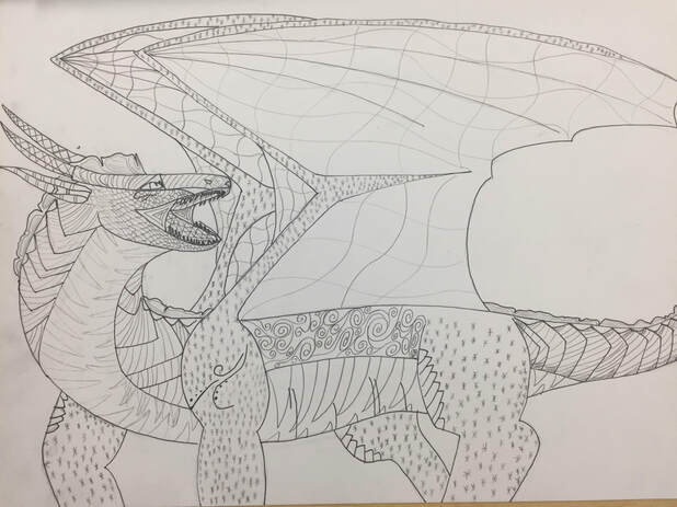
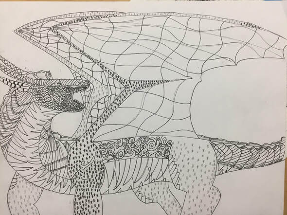
'I arranged my composition so that the body of my dragon carried you though the entire piece, from the head to the tail. So in that regard i do believe that this is a successful composition. I used the patterns on my dragon to give continuity to her biology. The wings need to be strong yet light so i gave it a lighter pattern while the underbelly needs to protect from any attacks from below so i patterned it to look harder yet curve around her neck and underbelly. Value is important in this piece because of how she is facing. without value you wouldn't be able to make out head from tail. Value in this piece allows you to see That there is a second wing behind the first and that she does indeed have four legs and is not two dimensional. The piece crafted very well, i planned out the pattern with pencil before applying the pen and i think this helped me to better plan the texture and make it visually appealing. My practice studies helped me to learn how a pattern curves around an object and this is very critical in my composition because of the nature of living things. The concepts taught in class are very important because they taught me that you have to express depth through shading and more of the pattern rather than more pen because you don't have as much flexibility unlike a pencil. This project helped me learn the importance of good planning and slow steady strokes, this is good because i have a bad habit of wanting to just get it done, and as a wise man once said." You can't rush art." If i had to recreate this piece i would change the back right leg because it looks out of place and small compared to the rest of the dragon.
Prisma Practice
The pastel I found was probably the 2nd hardest to work with, the watercolor being the hardest and the prisma the easiest. When working with the pastel I noticed that the color was very easy to mix, in some cases this would be very beneficial because you want a natural transition from color to color, but in others it is very hard to mitigate when you want those hard differences in color.
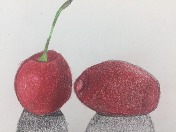
For my prisma final I drew two cherries. The one on the left I think I did much better than the other. The shadows are more pronounced and the color mixes much better. This is in part i think because i went with the direction of the cherry, unlike the one on the right where you can't tell that it's round.
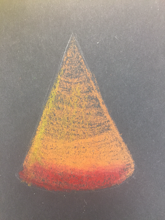
Pastel Practice
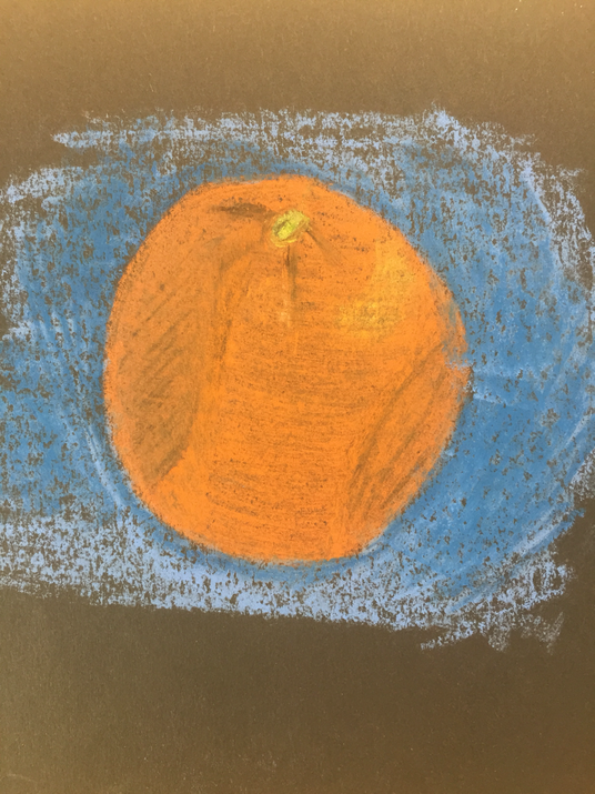
For my Pastel final I drew an orange. I think it turned out well owing to the color differences. however, the fact that i didn't shade with the object in the shadowed regions caused the orange to look as though it is intended in those areas as opposed to just being in shadow. although a cool effect, i think it ruined what i was trying to draw. On the plus side the fact that i shadowed the area behind the orange with shades of blue helped the orange to really pop off the page.
The watercolors were definitely the hardest to work with, owing to the fact that you couldn't apply more color until the paper was dry. This means that any corrections you need to do will take time. However, i do like how vibrant and colorful you can make the item in question and how you can mix it with background to make it pop.
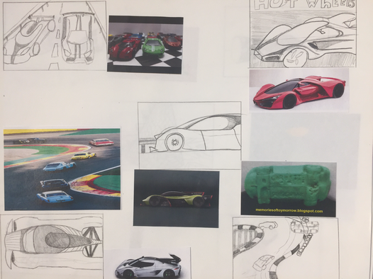
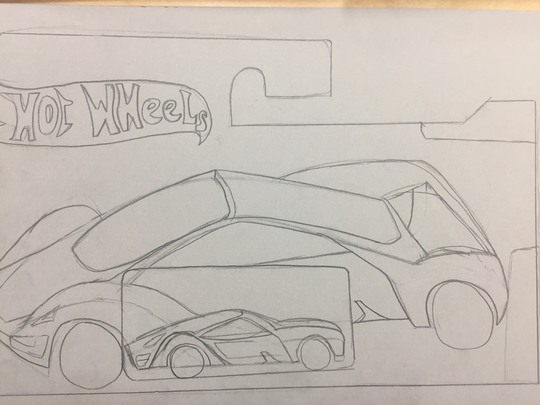
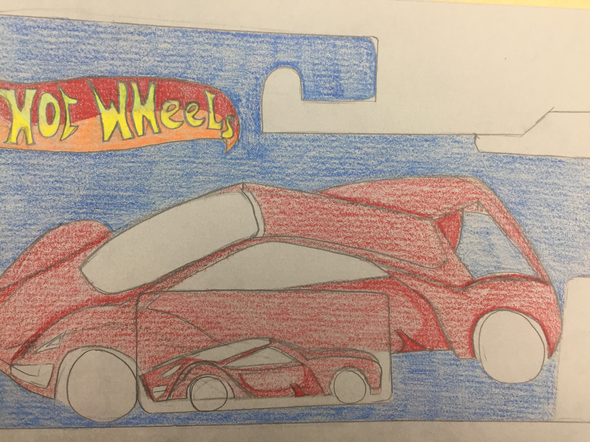
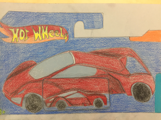
My composition is balanced because even though there's a lot of red its balanced out by the blue surrounding. You are also drawn through the piece from the fender of the sports car through to the spoiler. I used value to create the fact that the smaller car is in front of the printed one. The lines are darker near where they intersect and the lead car is lighter showing that it's in front. By using exaggerated color i achieved the effect of making the car look very kid friendly, because kids are almost drawn to colorful toys this would be very impactful to its design. As far as color goes i feel like i could have added variations of reds to really make the car pop and give the smaller car a little more definition and create more defined areas of value. I was able to achieve a fair amount of value in the fore, middle and back, but i feel like if i had made the background darker that it would have made everything else really shine through the bright colors. The color pencils for the most part were easy to use but they are very limited in the area of mixing and creating a very smooth transition through the colors. however there is proof in how easy they are to use and how vibrant they are, so for more colorful projects these would work wonderfully,( they also don't leave an annoying residue on your fingers.)

Final
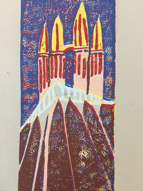
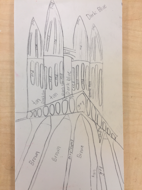
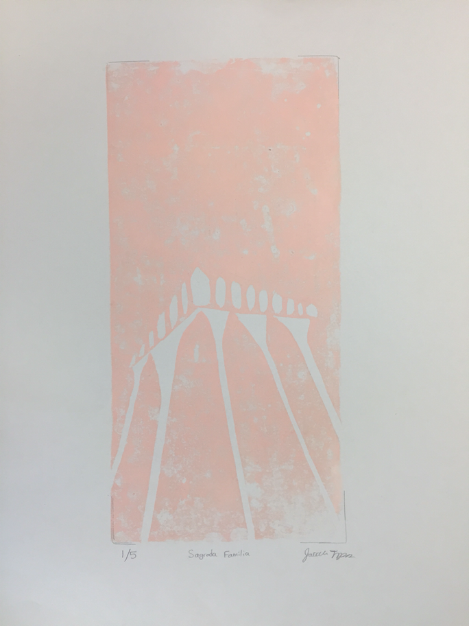
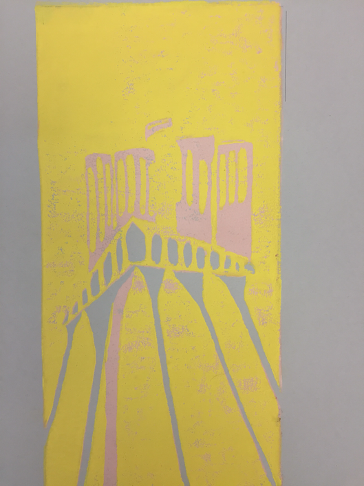
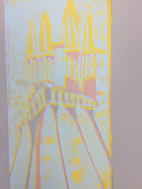
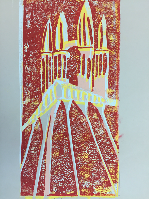
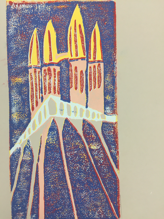
The craftsmanship of my prints is overall pretty good. There are no outlying lines and they're lined up fairly well. However the ink coverage could have been better and i could have conveyed more texture throughout the piece. My color choice was pretty decent. i feel that i stayed pretty true to the original photo with the exception of the red which i substituted in place of black. The texture was also very hard to convey because its all stone and its curving away from you making it hard to show the depth and texture. Although its hard to convey texture it was nice to keep some color flow to it and keep like items together such as the pillars or the support beams on the bottom. If i had to recreate this piece i would create some more texture patterns and also ensure that i get a smooth layer of ink to remove the blank patches that are present on the final.
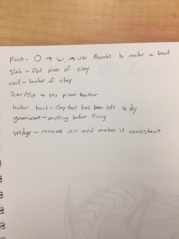
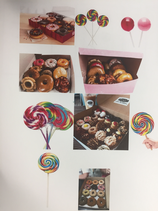
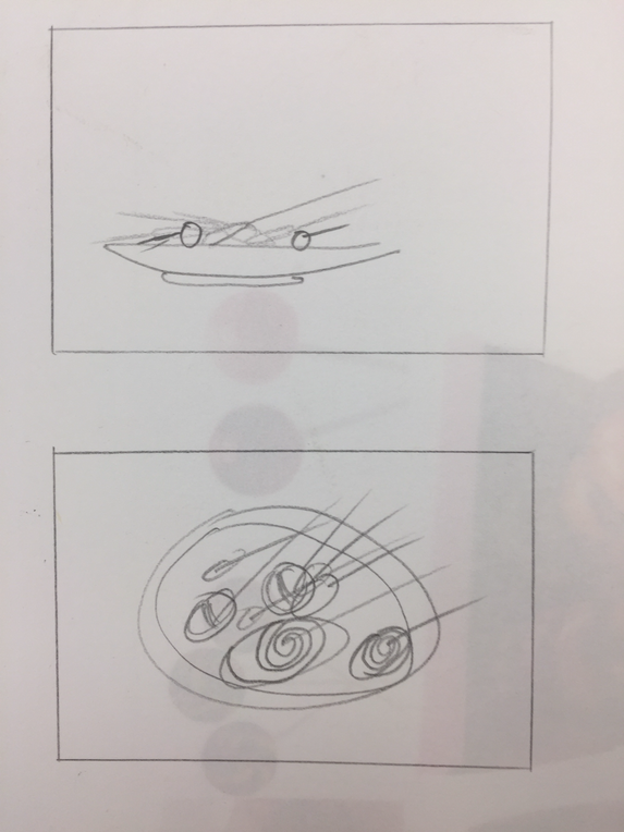
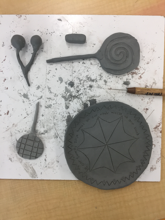
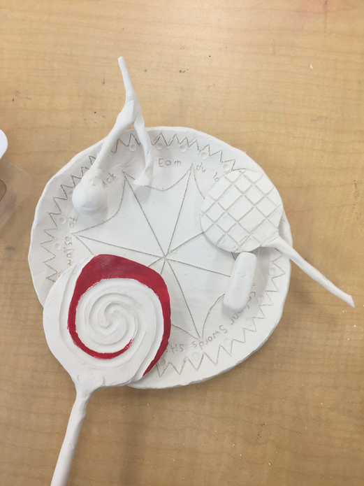
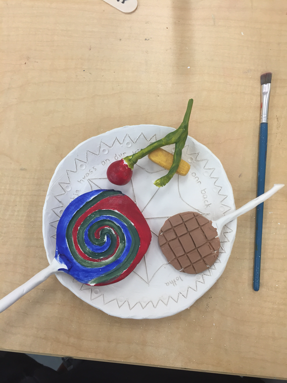
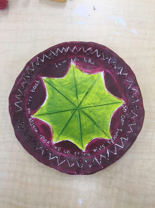
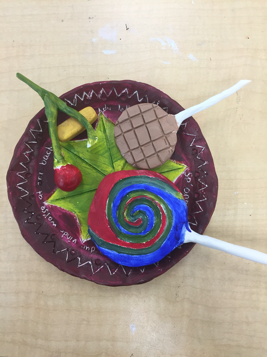
The craftsmanship of my piece is overall decent. There are no rough edges and all the elements should work together and look realistic. The most difficult part of this project was trying to both mold the clay to what you needed without making it crumble or get to soggy as well as working in 3D. My colors do work together. The bowl not only has design elements that allow you to look at it longer but it also makes the food stand out. Because my food is in a very flat plate allowing you to see most of the piece without having to see multiple sides of it. However to read the text you will need to move the base. When designing a 2D piece the biggest concern is shading to make what you want to pop out, however when working in 3D you don't have to worry about this so you are free to focus on texture and composition. to create the textures I used tools to flatten and smooth the lollipops as well as the bowl, then i left the cherries alone so that they could seem more natural. Yes my food does look like the actual food, since lollipops are coated in a sugar glaze they are very smooth, the same goes for the bowl. i would use more clay or more water seeing as my parts fell apart in some areas.
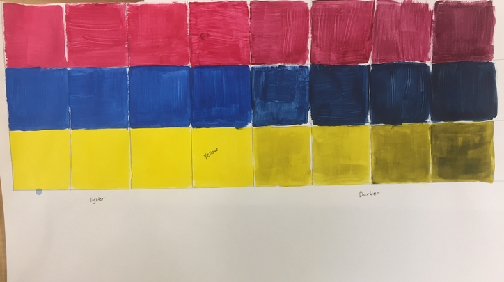
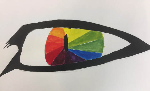
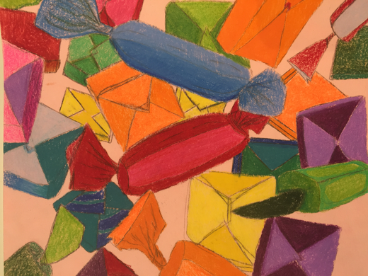
To do both of these I added black to lighter colors to get shades or tints, then to do the color wheel i added the colors to each other. I tried to be original with my color wheel by making a dragon eye, but it ended up that eyes were actually a very popular thing to draw/paint. However i did not see another dragon eye, so in my eyes(see what i did there?) it was still original. i used a lot of black around the eye to draw you into the colors and make them appear more vibrant, although i feel like i could have added something more to get rid of all the extra white space.
